Qualitative Visualization
What is Qualitative Visualization?
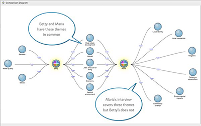
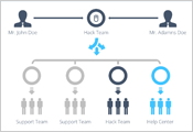
A visualization of coded interview data generated by the CAQDAS tool, NVivo.
Qualitative visualizations are used to communicate qualitative data — non-numeric information that doesn't involve measurements or quantities. Qualitative visualizations vary greatly and can include anything from word clouds to timelines to illustrative diagrams.
Coding Qualitative Data
A popular approach to qualitative data analysis is to mark a certain section of qualitative data with a particular code when it falls into a specific theme or category. For example, imagine you interview a number of people about their daily routine. You can code the parts of the interviews where people talk about waking up, drinking coffee and going to work as "morning routine". When they talk about brushing their teeth, setting their alarms and going to bed, you can code that information as "evening routine". Coding then allows you to answer such questions as: do people spend more time on average talking about their morning routine or their evening routine?
The results of coded qualitative data analysis can often be visualized in a similar way to quantitative data using basic data visualization tools.
Coding qualitative data is often done through CAQDAS (Computer Assisted Qualitative Data Analysis), and there are a number of software programs that specialize in coding. For more information about CAQDAS and coding qualitative data, please contact the Odum Institute for Social Science.
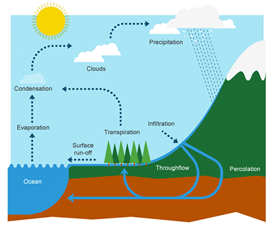
An illustrative diagram published by BBC Bitesize.
Text analysis
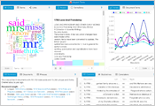
Text analysis examines the structure and linguistic features of a collection of text in order to detect measurable patterns. Like coding, text analysis allows us to visualize qualitative information in a quantitative way. For example, a word cloud demonstrates the number of times certain words are used in a piece of text by making a word larger or smaller depending on its frequency. Simple text analysis can be performed with a user-friendly tool like Voyant, but more complex analysis may require a programming language such as Python. For help getting started with text analysis, please contact a Data Analyst.
Illustrative Diagrams
If you want to produce a data visualization but you don't have any kind of dataset to work from, you most likely need to create an illustrative diagram. Diagrams that involve basic shapes such as flowcharts and mind maps can easily be made with Microsoft Powerpoint. Detailed or complex illustrations are usually created with professional design software like Adobe Illustrator. You will likely need some basic understanding of design concepts to create a successful illustrative diagram using professional design software. Contact the Design Lab at the Undergraduate Library for help learning design skills and software training. Alternatively, if hiring a professional is an option, UNC Creative provides a range of design services.
Tools for Creating Qualitative Visualizations
|
Voyant ToolsVoyant is a user-friendly text analysis tool that provides a graphical interface with many visualization options. Simply copy and paste your text or upload text files, and Voyant will analyze your text for you. We strongly encourage the use of Voyant Server rather than the web version of Voyant due to performance issues. |
|
Adobe IllustratorAdobe Illustrator is the industry standard for creating illustrations including infographics and illustrative diagrams. It will take a lot of learning and practice to become well versed in Illustrator, but doing so will enable you to design many types of beautiful graphics for data visualizations and beyond. UNC students can get a free subscription to Adobe Cloud while faculty and staff can obtain one by request. |
|
Microsoft PowerPointPowerPoint can be a less intimidating tool for those who are used to working in Microsoft Office. Powerpoint allows the creation of charts and graphs from copied and pasted data, and it includes many shape tools that can be used to develop infographics and diagrams when applied creatively. |
 |
Timeline JSTimeline JS is a free, easy-to-use tool for creating interactive timelines using Google Sheets. A myriad of different media types can be added to your timeline including images, video, web pages, maps and even tweets! |

