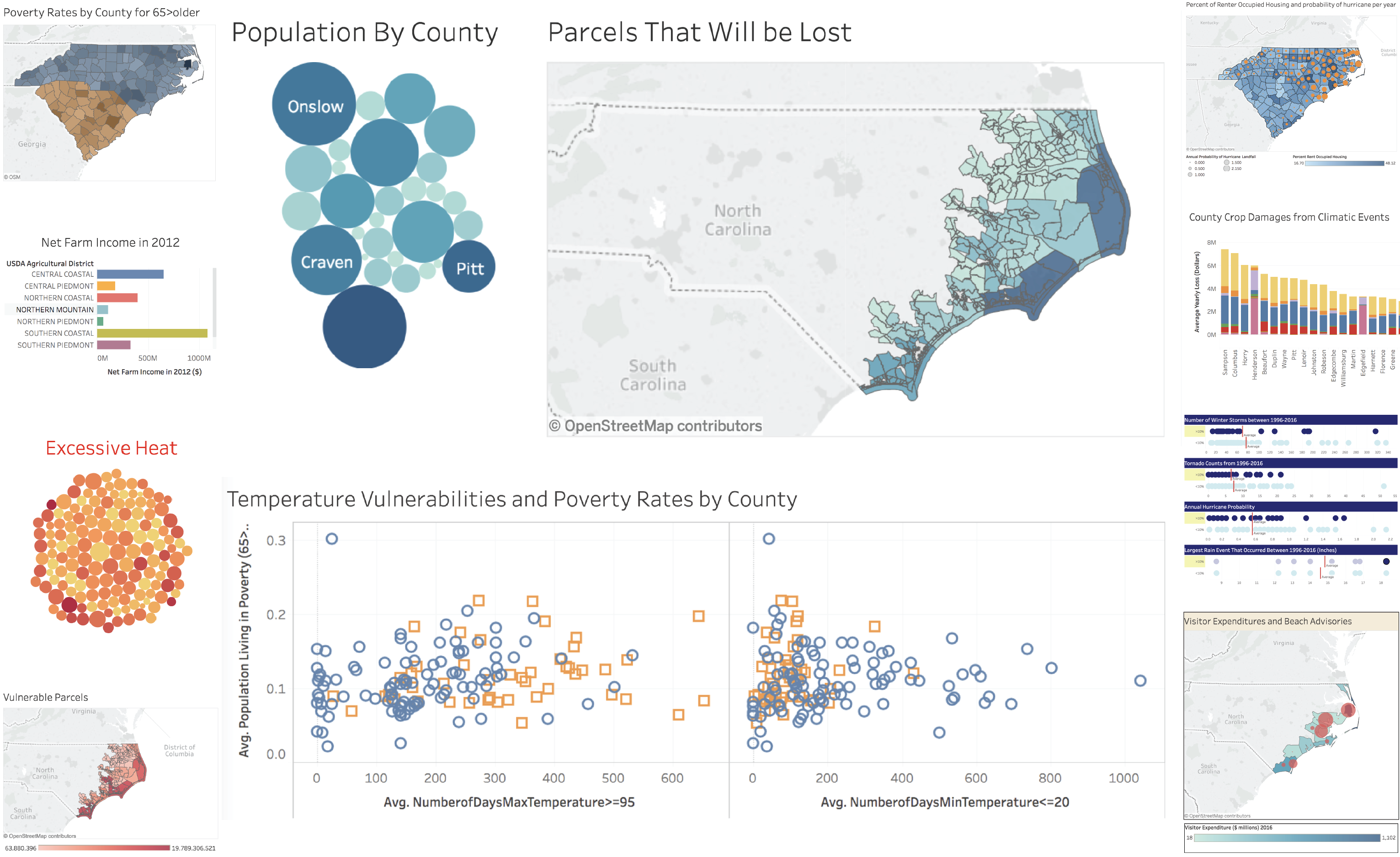
For her Spring 2018 and Fall 2019 Geography 370 classes, Dr. Ashley Ward encouraged students to creatively employ data visualization to tell stories. Students in the Introduction to Geographic Information course worked with spatial data on climate in North Carolina, creating Tableau dashboards to show vulnerabilities to extreme climate events. The Research Hub Data Analyst, Data Visualization Librarian, and GIS Librarian helped students clean, organize and present their data in Tableau.
For their final products, students created interactive visualizations including maps, bar graphs, scatterplots, bubble charts, and a dot plot. The data was sourced from the US Census, NOAA, FEMA, and a number of other agencies. Staff from the Southeast Regional Climate Center worked with students to ensure comprehension of climate extremes and data.
The projects teach students how to communicate data effectively, providing resources for a broad range of professional fields. One of the projects, Ashley Mullikin’s “Ambulatory Disability Vulnerability in North Carolina,” won first place in the undergraduate category of UNC’s 2018 Innovative Use of GIS Competition.


